Redesigning three platforms for a disaster response nonprofit
Redesigning three platforms for a disaster response nonprofit
WCC connects volunteers to communities in crisis. I audited and redesigned their public site, disaster tool, and training portal, reducing IA from 30 to 16 pages.
Accessibility Audit
WCAG
Nonprofit


Role
UX/UI Designer
Year
2024-25
Team
CEO
Me and 1 BE Engineer
Redesigning Disaster Response Platform for Accessible Emergency Education
Conducted accessibility audit and redesigned complete public website, training portal, and disaster reporting system to achieve WCAG 2.1 AA compliance and ensure life-saving resources reach everyone.
Accessibility Audit
WCAG
Nonprofit
Role
UX/UI Designer
Year
2024-25
Team
CEO
Me
1 BE Engineer
Overview
Overview
World cares center's digital platform had severe architecture information problems and accessibility barriers preventing volunteers from finding training and reporting disasters.
World cares center's digital platform had severe architecture information problems and accessibility barriers preventing volunteers from finding training and reporting disasters.
World Cares Center is a New York-based NGO supporting underserved communities through disaster preparedness and response. I joined the project through Taproot as a volunteer UX/UI designer, collaborating weekly with the WCC team and engineer to assess the platform and redesign across three areas: the public website, the disaster reporting tool, and the training portal. I also implemented some pages directly in WordPress.
World Cares Center is a New York-based NGO supporting underserved communities through disaster preparedness and response. I joined the project through Taproot as a volunteer UX/UI designer, collaborating weekly with the WCC team and engineer to assess the platform and redesign across three areas: the public website, the disaster reporting tool, and the training portal. I also implemented some pages directly in WordPress.
The ecosystem included:
The ecosystem included:
Public Website - Mission, team, and program information
Public Website - Mission, team, and program information
Volunteer Training Portal- Account creation, courses, and certifications
Volunteer Training Portal- Account creation, courses, and certifications
Disaster Reporting System- Real time incident reporting by trained volunteers
Disaster Reporting System- Real time incident reporting by trained volunteers
Site assessment
Site assessment
Understanding what existed before deciding what to change.
Understanding what existed before deciding what to change.
Starting with a full platform review
I began by reviewing every page, tracing the navigation structure, and documenting where the experience created friction. Weekly team meetings helped me understand which workflows mattered most, which content was actively used, and which constraints were fixed before any design work started.
I began by reviewing every page, tracing the navigation structure, and documenting where the experience created friction. Weekly team meetings helped me understand which workflows mattered most, which content was actively used, and which constraints were fixed before any design work started.
The platform reflected years of real organizational work. My role was to understand the intent behind what existed, then find where structure and usability could better support it.
The platform reflected years of real organizational work. My role was to understand the intent behind what existed, then find where structure and usability could better support it.
The platform reflected years of real organizational work. My role was to understand the intent behind what existed, then find where structure and usability could better support it.
Information architecture
Information architecture
The content was valuable. Finding it was the challenge.
The content was valuable. Finding it was the challenge.
Starting with a full platform review
I mapped the full IA before proposing any changes. The site had grown organically, pages added as needed, without a unifying structure. Training content was spread across multiple branches, the volunteer journey had no clear throughline, and some pages cross-linked laterally in ways that made hierarchy hard to read.
I mapped the full IA before proposing any changes. The site had grown organically, pages added as needed, without a unifying structure. Training content was spread across multiple branches, the volunteer journey had no clear throughline, and some pages cross-linked laterally in ways that made hierarchy hard to read.
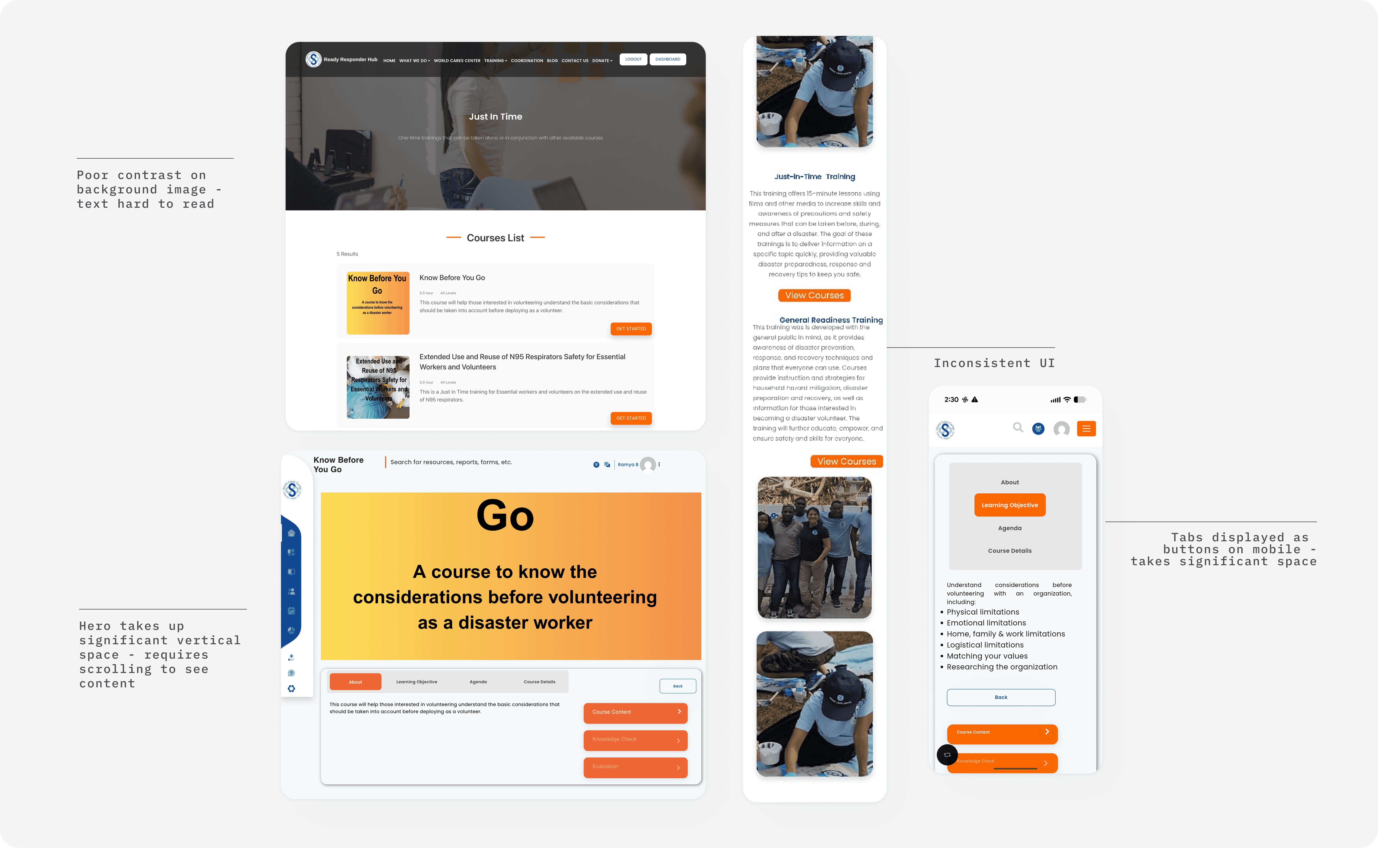
Broken Information Architecture
Accessibility Barriers
Poor Mobile Experience
The site suffers from poor discoverability due to a lack of logical hierarchy and categorization. Missing Calls to Action (CTAs) leave volunteers without clear next steps in their journey.
The site suffers from poor discoverability due to a lack of logical hierarchy and categorization. Missing Calls to Action (CTAs) leave volunteers without clear next steps in their journey.
Broken Information Architecture
Lighthouse revealed 72/100 accessibility score. WAVE identified 21 errors including contrast failures, missing alt text, and broken keyboard navigation. Forms had no proper labels or error handling.
Website, portal, and reporting system were not responsive, making it unusable on mobile devices that field volunteers rely on during emergencies.
Accessibility Barriers
Website, portal, and reporting system were not responsive, making it unusable on mobile devices that field volunteers rely on during emergencies.
Lighthouse revealed 72/100 accessibility score. WAVE identified 21 errors including contrast failures, missing alt text, and broken keyboard navigation. Forms had no proper labels or error handling.
Poor Mobile Experience

Before- Information of Public website
Before- Information of Public website
Website
Website
Redesigning the full site experience
Redesigning the full site experience
The public website was WCC's primary presence for anyone discovering the organization & communicating their disaster response programs, showcasing volunteer impact, and providing pathways to get involved through training or donations. The redesign covered every page: homepage, about, what we do, training, coordination, get involved, blog, contact, and more
The public website was WCC's primary presence for anyone discovering the organization & communicating their disaster response programs, showcasing volunteer impact, and providing pathways to get involved through training or donations. The redesign covered every page: homepage, about, what we do, training, coordination, get involved, blog, contact, and more
What I found
What I found
Current state issues
Current state issues
Complex multi-level navigation with overlapping labels and no clear hierarchy
Complex multi-level navigation with overlapping labels and no clear hierarchy
Inconsistent page layouts and visual language across the site
Inconsistent page layouts and visual language across the site
Unclear path from learning about WCC to taking any action
Unclear path from learning about WCC to taking any action
Dense text-heavy pages with poor visual hierarchy throughout
Dense text-heavy pages with poor visual hierarchy throughout
Inconsistent buttons and touch targets site-wide
Inconsistent buttons and touch targets site-wide

Before- Public website- home, donation and mobile training page.
Before- Public website- home, donation and mobile training page.
Competitive research
Competitive research
I looked at American Red Cross and Team Rubicon to understand how established disaster relief organizations communicate mission and guide visitors to action.
I looked at American Red Cross and Team Rubicon to understand how established disaster relief organizations communicate mission and guide visitors to action.
Key insight applied to WCC
Key insight applied to WCC
Both sites treat each page as a step in a journey, clear mission, credibility, one action per section. I applied this across the full WCC site, giving every page a defined purpose and a contextual next step rather than ending in a wall of information.
Both sites treat each page as a step in a journey, clear mission, credibility, one action per section. I applied this across the full WCC site, giving every page a defined purpose and a contextual next step rather than ending in a wall of information.

What I redesigned
What I redesigned
I redesigned the full site, establishing a consistent visual language, simplifying navigation, and giving each page a clear purpose and next step. The homepage anchors the narrative, but every page was touched: structure, hierarchy, content organization, and mobile responsiveness.
I redesigned the full site, establishing a consistent visual language, simplifying navigation, and giving each page a clear purpose and next step. The homepage anchors the narrative, but every page was touched: structure, hierarchy, content organization, and mobile responsiveness.
The challenge wasn't any single page, it was that pages had been built independently, without a shared system. Consistency across the site was as important as any individual redesign decision.
The challenge wasn't any single page, it was that pages had been built independently, without a shared system. Consistency across the site was as important as any individual redesign decision.
Unified visual language across all pages
Inconsistent layouts across pages created cognitive load and visitors had to reorient on every new page. A cohesive system makes the site feel trustworthy.
Every page has a clear purpose and next step
Pages without direction lose visitors. Each redesigned page ends with a contextual CTA that moves the visitor forward, whether its learning more, signing up, or donating.
Simplified navigation with clear labels
Multi-level nav with overlapping labels made it hard to find anything. Simplified structure lets visitors locate what they need without guessing.
Mobile-responsive layouts throughout
Multiple pages were broken on mobile. Since a significant portion of visitors arrive on phones, responsiveness wasn't optional, it was a baseline requirement across the entire site.

After - Public website- home, training and donation pages.
After - Public website- home, training and donation pages.
Disaster Reporting tool
Disaster Reporting tool
The form wasn't broken. It just wasn't built for the people using it.
The form wasn't broken. It just wasn't built for the people using it.
Field volunteers needed to file disaster reports quickly from their phones, often outdoors, under stress, with unstable connections. The existing form had never been designed with that context in mind. It was a desktop data-entry form dropped onto mobile.
Field volunteers needed to file disaster reports quickly from their phones, often outdoors, under stress, with unstable connections. The existing form had never been designed with that context in mind. It was a desktop data-entry form dropped onto mobile.
The organization's data requirements couldn't change, the 20+ fields fed partner coordination workflows that multiple agencies depended on. So I couldn't simplify the form. I had to make the existing complexity survivable under emergency conditions.
The organization's data requirements couldn't change, the 20+ fields fed partner coordination workflows that multiple agencies depended on. So I couldn't simplify the form. I had to make the existing complexity survivable under emergency conditions.
What I found
What I found
Current state issues
20+ disaster type options in overwhelming scrolling checklist with no grouping
20+ disaster type options in overwhelming scrolling checklist with no grouping
Forms scattered across 5 screens with no "Save Draft" option
Forms scattered across 5 screens with no "Save Draft" option
Desktop-only layout completely broken on mobile phones
Desktop-only layout completely broken on mobile phones
Small touch targets impossible to use with gloves or under stress
Small touch targets impossible to use with gloves or under stress

Before- Disaster Reporting System - home page desktop view and mobile view,
Before- Disaster Reporting System - home page desktop view and mobile view,
Competitive research
Competitive research
No direct comparator exists for a field based disaster reporting tool. I looked at adjacent tools like typeform and survey monkey to understand best practices for grouping fields and reducing cognitive load in multi-step mobile forms.
No direct comparator exists for a field based disaster reporting tool. I looked at adjacent tools like typeform and survey monkey to understand best practices for grouping fields and reducing cognitive load in multi-step mobile forms.
Key insight applied to WCC
Key insight applied to WCC
Both tools validate grouping related fields together and breaking long forms into manageable sections. I applied this directly to the disaster reporting form organizing fields by category and grouping related inputs in rows to reduce cognitive load under field conditions.
Both tools validate grouping related fields together and breaking long forms into manageable sections. I applied this directly to the disaster reporting form organizing fields by category and grouping related inputs in rows to reduce cognitive load under field conditions.
Design Decisions
Design Decisions
Volunteers needed to find the right course, earthquake response, flood response, community preparedness quickly, on a phone, without navigating deep menus. Cards are scannable. Filters enable self-service.
Volunteers needed to find the right course, earthquake response, flood response, community preparedness quickly, on a phone, without navigating deep menus. Cards are scannable. Filters enable self-service.
This was the hardest constraint of the project. The answer wasn't fewer fields, it was better organization, smarter error handling, and a mobile experience that respected the conditions volunteers were actually in.
This was the hardest constraint of the project. The answer wasn't fewer fields, it was better organization, smarter error handling, and a mobile experience that respected the conditions volunteers were actually in.
Grouped related fields with persistent Save Draft
Related fields like Title, Name, and Organization are grouped together to reduce cognitive load. Combined with Save Draft on every screen, volunteers can pause and resume without losing progress which is critical when field connections drop mid-submission.
Disaster types organized by category
Categorical grouping lets volunteers scan to the right area quickly rather than reading through a long undifferentiated list.
Mobile-first layout with adapted inputs
The original form was desktop only and broke on phones. I redesigned the layout to be mobile first, responsive columns, 44×44px touch targets, and appropriate input types so the form works reliably on the devices volunteers actually carry in the field.
Specific inline error messages
Vague errors require troubleshooting under time pressure. Specific guidance helps volunteers move forward without frustration.

After- Disaster Reporting System - home page desktop view and mobile view,
After- Disaster Reporting System - home page desktop view and mobile view,
Training portal
Training portal
Optimizing the moment volunteers enter the catalog.
Optimizing the moment volunteers enter the catalog.
The training portal was the learning hub where volunteers created accounts, accessed disaster response courses, tracked their progress toward certifications, and maintained their credentials. This platform transformed interested community members into trained, certified disaster responders.
The training portal was the learning hub where volunteers created accounts, accessed disaster response courses, tracked their progress toward certifications, and maintained their credentials. This platform transformed interested community members into trained, certified disaster responders.
What I found
What I found
Current state issues
Deep navigation hierarchy making courses hard to find
Deep navigation hierarchy making courses hard to find
Users cannot see the course content unless they have an account
Users cannot see the course content unless they have an account
Inconsistent User interface leading to cognitive load.
Inconsistent User interface leading to cognitive load.
Before- Training Portal - courses desktop view and mobile view
Before- Training Portal - courses desktop view and mobile view
Competitive research
Competitive research
I looked at Coursera and Udemy to understand how learning platforms handle course discovery, preview, and registration.
I looked at Coursera and Udemy to understand how learning platforms handle course discovery, preview, and registration.
Key insight applied to WCC
Key insight applied to WCC
While technical constraints required a login-first approach, unlike the open models of Coursera or Udemy, I focused on optimizing the "moment of entry." I redesigned the post-signup catalog using a clean, card-based layout. This allowed volunteers to scan high-level course data and identify relevant content instantly, eliminating the need to dig through complex nested menus.
While technical constraints required a login-first approach, unlike the open models of Coursera or Udemy, I focused on optimizing the "moment of entry." I redesigned the post-signup catalog using a clean, card-based layout. This allowed volunteers to scan high-level course data and identify relevant content instantly, eliminating the need to dig through complex nested menus.

What I redesigned
What I redesigned
Volunteers needed to find the right course, earthquake response, flood response, community preparedness, quickly without navigating deep menus. Cards are scannable.
Volunteers needed to find the right course, earthquake response, flood response, community preparedness, quickly without navigating deep menus. Cards are scannable.
Card-based course catalog
Nested menus required volunteers to click through multiple levels before seeing any course details. Cards surface all relevant information at one level, no digging required.
Consistent card structure across all course types
The original portal had inconsistent layouts between course types, creating visual noise. A unified card pattern makes the catalog feel predictable and easy to scan.

After - Training Portal - courses desktop view
After - Training Portal - courses desktop view
Accessibility audit
Accessibility audit
Two layers of testing. Each found what the other missed.
Two layers of testing. Each found what the other missed.
Accessibility wasn't scoped into the project at this stage. But given the platform is built for volunteers filing reports in emergencies, community members across varying abilities and literacy levels, I ran a full audit on my own to understand the gaps.
Accessibility wasn't scoped into the project at this stage. But given the platform is built for volunteers filing reports in emergencies, community members across varying abilities and literacy levels, I ran a full audit on my own to understand the gaps.
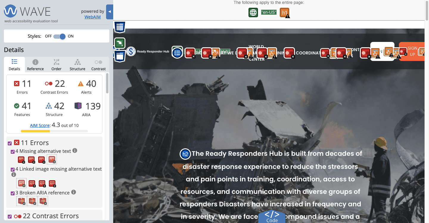
I combined automated testing with WAVE and Lighthouse, and manual keyboard navigation testing to get the full picture. Each method surfaced something the others didn't.
I combined automated testing with WAVE and Lighthouse, and manual keyboard navigation testing to get the full picture. Each method surfaced something the others didn't.
21
Contrast errors affecting readability
11
Errors including missing alt text and broken ARIA
4.3
AIM accessibility score out of 10
21
Contrast errors affecting readability
11
Errors including missing alt text and broken ARIA
4.3
AIM accessibility score out of 10
Key insight applied to WCC
Key insight applied to WCC
These weren't abstract compliance gaps. For volunteers reading screens outdoors, low contrast is a real usability failure. For users relying on screen readers, missing alt text means hitting dead ends. For anyone on a weak field connection, a 12.5s load time means the tool may not load at all.
These weren't abstract compliance gaps. For volunteers reading screens outdoors, low contrast is a real usability failure. For users relying on screen readers, missing alt text means hitting dead ends. For anyone on a weak field connection, a 12.5s load time means the tool may not load at all.
22 contrast errors across the site
Text and background combinations throughout failed the 4.5:1 minimum ratio. I built a corrected color palette into the design system where every combination meets WCAG 2.1 AA standards.
8 images missing alt text, 3 broken ARIA
Missing alt text leaves screen reader users with no information about image content. Broken ARIA references cause assistive technology to announce incorrect information at key interaction points. Both were identified during the audit and flagged to the engineer.
Tab order was intact but focus indicators invisible
Elements received focus in a logical order, but nothing highlighted visually. The only signal was the browser's status bar. I added visible focus styles to all interactive elements in the redesign.
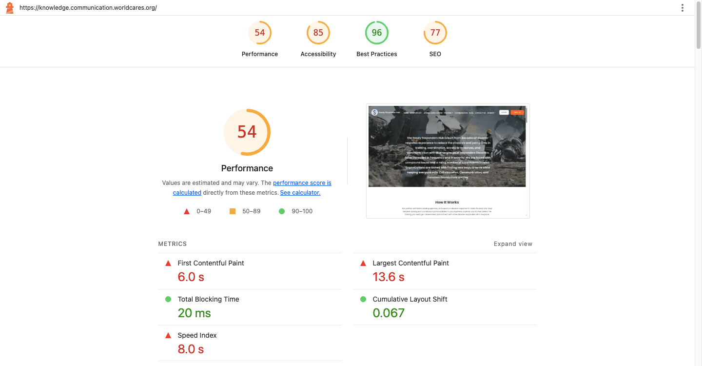
Performance score 54/100
A 12.5s load time is a real barrier for volunteers on mobile with weak field connections. I flagged heavy assets and recommended image compression to the engineer.
22 contrast errors across the site
Text and background combinations throughout failed the 4.5:1 minimum ratio. I built a corrected color palette into the design system where every combination meets WCAG 2.1 AA standards.
8 images missing alt text, 3 broken ARIA
Missing alt text leaves screen reader users with no information about image content. Broken ARIA references cause assistive technology to announce incorrect information at key interaction points. Both were identified during the audit and flagged to the engineer.
Tab order was intact but focus indicators invisible
Elements received focus in a logical order, but nothing highlighted visually. The only signal was the browser's status bar. I added visible focus styles to all interactive elements in the redesign.
Performance score 54/100
A 12.5s load time is a real barrier for volunteers on mobile with weak field connections. I flagged heavy assets and recommended image compression to the engineer.
Reflection
Reflection
What I took away from designing within real constraints.
What I took away from designing within real constraints.
The designs were completed and delivered, but organizational factors at the time meant implementation didn't follow. Design readiness and organizational readiness don't always arrive together.
The designs were completed and delivered, but organizational factors at the time meant implementation didn't follow. Design readiness and organizational readiness don't always arrive together.
Constraints are design inputs. The fixed data requirements forced me to think about organization and clarity rather than simplification
Do the work no one asked for. Running the accessibility audit independently shaped decisions across all three platforms. The best time to consider accessibility is before the designs are done.