Unifying the experience:
Building a 0-to-1 design system to resolve design debt.
Unifying the experience:
Building a 0-to-1 design system to resolve design debt.
Built Nombolo's first component library from scratch while shipping features and keeping a dual-sided platform consistent as it scaled.
Built Nombolo's first component library from scratch while shipping features and keeping a dual-sided platform consistent as it scaled.
MVP
Accessibility
Scalable design system
Scalable design system
Figma
Accessibility
MVP
MVP
Scalable design system
Figma
Figma
Unifying the experience:
Building a 0-to-1 design system to resolve design debt.
Built Nombolo's first component library from scratch while shipping features and keeping a dual-sided platform consistent as it scaled.
MVP
Accessibility
Scalable design system
Scalable design system
Figma
Accessibility
MVP
MVP
Scalable design system
Figma
Figma


Role
Product Designer
Product Designer
Year
Year
2024-25
2024-25
My Impact
My Impact
Unified Component Architecture
Unified Component Architecture
Boosted UI Consistency
Boosted UI Consistency
Faster Feature Building
Faster Feature Building
Overview
I built the foundational design system for Nombolo, turning a growing platform into a cohesive ecosystem through a logic-driven component library.
I built the foundational design system for Nombolo, turning a growing platform into a cohesive ecosystem through a logic-driven component library.
As the Founding Designer, I recognized that the lack of a formal design language was creating significant technical debt and user friction. I took the initiative to audit our legacy interfaces and build a comprehensive library of 50+ master components. This effort did more than just fix the visuals, it created a collaborative bridge between design and engineering, allowing us to ship accessible, consistent features across iOS, Android and web.
As the Founding Designer, I recognized that the lack of a formal design language was creating significant technical debt and user friction. I took the initiative to audit our legacy interfaces and build a comprehensive library of 50+ master components. This effort did more than just fix the visuals, it created a collaborative bridge between design and engineering, allowing us to ship accessible, consistent features across iOS, Android and web.
Problem
The starting point: Fragmented UI & significant design debt
The starting point: Fragmented UI & significant design debt
Without a unified framework, every new feature increased technical friction and diluted the user experience.
Without a unified framework, every new feature increased technical friction and diluted the user experience.
No Component Library
Accessibility & Readability Gaps
Weak Information Architecture
Every feature required building UI from scratch, leading to inconsistant patterns and a fragmented interface that confused users.
Every feature required designing buttons, inputs from scratch
No Component Library
An over-reliance on pure black (#000000) and lack of defined contrast standards created high visual vibration and failed WCAG 2.1 AA compliance.
An over-reliance on pure black (#000000) and lack of defined contrast standards created high visual vibration and failed WCAG 2.1 AA compliance.
Inconsistent Colors
Without a standardized typographic scale, it was difficult for users to distinguish between primary actions and secondary content.
Without a standardized typographic scale, it was difficult for users to distinguish between primary actions and secondary content.
No Hierarchy Critical Data


Audit: The Legacy State
Static Style Sheets: Brand colors existed but lacked defined tints, shades, or logic for systematic application.
One-off Typography: Basic font choices were in use, but without a standardized scale or hierarchy rules.
Detached UI Elements: Buttons and inputs were designed screen-by-screen rather than pulled from a centralized library.
The Strategic Need
A "Single Source of Truth": To bridge the gap between design and engineering.
Standardized Handoff: To reduce the time developers spent guessing spacing and hex codes.
Semantic Tokens: To allow for rapid updates and future-proofing (like Dark Mode).
APPROACH
Strategy: From Audit to Atomic Foundations
Strategy: From Audit to Atomic Foundations
Building a design system while shipping live features required a pragmatic, atomic approach, starting with the foundational building blocks that everything else would depend on.
Building a design system while shipping live features required a pragmatic, atomic approach, starting with the foundational building blocks that everything else would depend on.
Strategy
Strategy
I leveraged Material Design principles as a framework to ensure technical feasibility and cross-platform parity. By focusing on Atomic Design methodology, I prioritized the creation of foundational elements like tokens, typography, and basic UI components to pay off design debt immediately without stalling the product roadmap.
I leveraged Material Design principles as a framework to ensure technical feasibility and cross-platform parity. By focusing on Atomic Design methodology, I prioritized the creation of foundational elements like tokens, typography, and basic UI components to pay off design debt immediately without stalling the product roadmap.
Multi-Platform Differentiation: Segmented the color system to provide distinct visual cues for merchants vs. customers.
Multi-Platform Differentiation: Segmented the color system to provide distinct visual cues for merchants vs. customers.
Semantic Token Architecture: Transformed brand colors into a logic-based token system (50 to 950 tints) to allow for scalable updates and dark mode readiness.
Semantic Token Architecture: Transformed brand colors into a logic-based token system (50 to 950 tints) to allow for scalable updates and dark mode readiness.
Typography Optimization: Migrated the system to Inter to improve legibility and technical performance across mobile and web interfaces.
Typography Optimization: Migrated the system to Inter to improve legibility and technical performance across mobile and web interfaces.
Core Component Sprint: Prioritized high-impact elements like buttons and text fields to establish immediate consistency in the build.
Core Component Sprint: Prioritized high-impact elements like buttons and text fields to establish immediate consistency in the build.
Foundational Logic: A Semantic Color System
Foundational Logic: A Semantic Color System
I transformed a rigid brand palette into a flexible, token-based system to provide distinct visual 'lanes' for a complex, dual-sided marketplace.
I transformed a rigid brand palette into a flexible, token-based system to provide distinct visual 'lanes' for a complex, dual-sided marketplace.
Rather than relying on a static set of colors, I architected a structured token system using a tint/shade scale (50–950). This provided the technical foundation for future proofing features like Dark Mode. By introducing distinct schemas for Merchants vs. Customers, I utilized color as a functional tool to provide immediate contextual orientation for our users.
Rather than relying on a static set of colors, I architected a structured token system using a tint/shade scale (50–950). This provided the technical foundation for future proofing features like Dark Mode. By introducing distinct schemas for Merchants vs. Customers, I utilized color as a functional tool to provide immediate contextual orientation for our users.
Strategic Brand Differentiation: Created separate color logic for Merchant and Customer flows to reduce cognitive load and provide clear visual cues for different user types.
Strategic Brand Differentiation: Created separate color logic for Merchant and Customer flows to reduce cognitive load and provide clear visual cues for different user types.
Semantic Engineering Handoff: Leveraged functional naming conventions, mapping colors directly to UI roles (e.g.,
Title,Border,Disabled) to ensure 1:1 parity between design and code.
Semantic Engineering Handoff: Leveraged functional naming conventions, mapping colors directly to UI roles (e.g.,
Title,Border,Disabled) to ensure 1:1 parity between design and code.
WCAG-Compliant Foundations: Every primary and secondary tint was tested to ensure the base system supports inclusive design and accessibility standards.
WCAG-Compliant Foundations: Every primary and secondary tint was tested to ensure the base system supports inclusive design and accessibility standards.


Defining Semantic Clarity: Typography & Neutrals
I resolved the 'pure black' vibration issue by architecting a functional neutral scale, enabling a clear information hierarchy that guides the user's eye without visual fatigue.
Audit: The Legacy State
My audit revealed that the legacy platform relied on a single pure black (#000000) for all text. This created harsh contrast and made it impossible to distinguish between primary headers and secondary metadata.
Lack of Hierarchy: Typographic weighting was inconsistent, making it difficult to scan information.
Reading Fatigue: Pure black (#000000) created high contrast strain, leading to poor reading ergonomics
Accessibility Gaps: Secondary labels failed WCAG contrast standards, creating barriers for low-vision users.

Strategic Information Architecture: The Neutral Palette
To ensure brand cohesion, I didn't just pick random grays. I engineered a custom neutral palette by sampling a subtle hue from the core Brand Purple resulting a Grey scale that feels harmonized with the brand identity rather than detached.
I then mapped these shades to Functional Tokens, such as Title, Body, and Helper Text, to bake hierarchy directly into the system logic.

Impact of neutral palette
Brand-Harmonized Neutrals: Custom grayscale derived from brand hues ensured total UI cohesion and a premium feel.
Seamless Handoff: Used semantic naming to ensure developers knew exactly which token to apply to which UI role.
WCAG 2.1 AA Compliance: Leveraged my CPACC expertise to guarantee every text combination meets rigorous accessibility standards.

Defining Semantic Clarity: Typography & Neutrals
I resolved the 'pure black' vibration issue by architecting a functional neutral scale, enabling a clear information hierarchy that guides the user's eye without visual fatigue.
Audit: The Legacy State
My audit revealed that the legacy platform relied on a single pure black (#000000) for all text. This created harsh contrast and made it impossible to distinguish between primary headers and secondary metadata.
Lack of Hierarchy: Typographic weighting was inconsistent, making it difficult to scan information.
Reading Fatigue: Pure black (#000000) created high contrast strain, leading to poor reading ergonomics
Accessibility Gaps: Secondary labels failed WCAG contrast standards, creating barriers for low-vision users.
Strategic Information Architecture: The Neutral Palette
To ensure brand cohesion, I didn't just pick random grays. I engineered a custom neutral palette by sampling a subtle hue from the core Brand Purple resulting a Grey scale that feels harmonized with the brand identity rather than detached.
I then mapped these shades to Functional Tokens, such as Title, Body, and Helper Text, to bake hierarchy directly into the system logic.

Impact of neutral palette
Brand-Harmonized Neutrals: Custom grayscale derived from brand hues ensured total UI cohesion and a premium feel.
Seamless Handoff: Used semantic naming to ensure developers knew exactly which token to apply to which UI role.
WCAG 2.1 AA Compliance: Leveraged my CPACC expertise to guarantee every text combination meets rigorous accessibility standards.
Typography System
I standardized the system on Inter for superior legibility. I established a responsive type scale to ensure consistent information architecture across all device viewports.


Contextual Guidance With Tool Tips
I standardized the system on Inter for superior legibility. I established a responsive type scale to ensure consistent information architecture across all device viewports.

Typography & Contrast
Typography & Contrast
Typography & Contrast
Defined Action Hierarchy: Clearer distinction between primary messages and secondary metadata.
Defined Action Hierarchy: Clearer distinction between primary messages and secondary metadata.
Optimized Reading Surface: Harmonized neutrals reduce eye strain compared to legacy pure black.
Verified Accessibility: Every combination meets WCAG 2.1 AA standards for low-vision users.


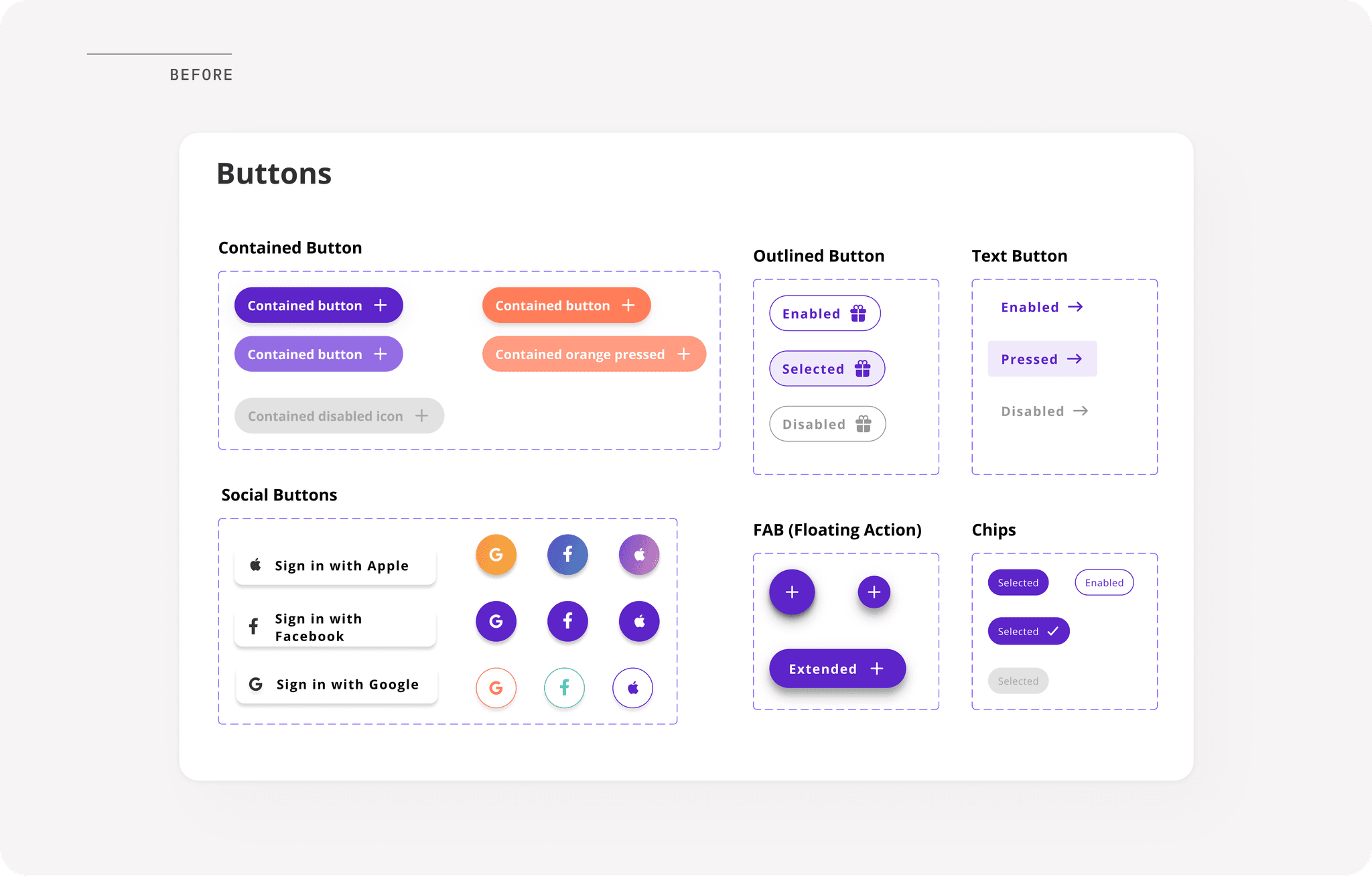
Component Architecture: Buttons & Interaction States
Component Architecture: Buttons & Interaction States
I transformed static, inconsistent elements into a centralized, variant-based library to ensure predictable user feedback.
I transformed static, inconsistent elements into a centralized, variant-based library to ensure predictable user feedback.
I moved the system away from 'one-off' buttons to a Figma Variant library. By defining specific visual cues for every interaction state, I eliminated user uncertainty and established a consistent interactive language across both Merchant and Customer platforms.
I moved the system away from 'one-off' buttons to a Figma Variant library. By defining specific visual cues for every interaction state, I eliminated user uncertainty and established a consistent interactive language across both Merchant and Customer platforms.
Interactive Foundations: Verified Accessibility
The legacy interactive palette relied on colors that failed basic WCAG requirements, creating significant barriers for users with low vision. Leveraging my CPACC expertise, I reengineered the primary action colors to ensure universal usability. By moving from a failing 2.52:1 contrast ratio to a robust 13.29:1, I guaranteed that core interactions are visible in all lighting conditions and for all users

Systemic Interaction: States & Variants
I replaced inconsistent, static buttons with a centralized Figma Variant library. This allowed for a defined hierarchy of Primary, Secondary, and Tertiary actions, ensuring users are intuitively guided toward 'North Star' goals. I mapped comprehensive states, Enabled, Hovered, Focused, Pressed, and Disabled, to provide immediate feedback and a predictable interactive experience across the platform.
Interactive Foundations: Verified Accessibility
Interactive Foundations: Verified Accessibility
The legacy interactive palette relied on colors that failed basic WCAG requirements, creating significant barriers for users with low vision. Leveraging my CPACC expertise, I reengineered the primary action colors to ensure universal usability. By moving from a failing 2.52:1 contrast ratio to a robust 13.29:1, I guaranteed that core interactions are visible in all lighting conditions and for all users
The legacy interactive palette relied on colors that failed basic WCAG requirements, creating significant barriers for users with low vision. Leveraging my CPACC expertise, I reengineered the primary action colors to ensure universal usability. By moving from a failing 2.52:1 contrast ratio to a robust 13.29:1, I guaranteed that core interactions are visible in all lighting conditions and for all users

Systemic Interaction: States & Variants
Systemic Interaction: States & Variants
I replaced inconsistent, static buttons with a centralized Figma Variant library. This allowed for a defined hierarchy of Primary, Secondary, and Tertiary actions, ensuring users are intuitively guided toward 'North Star' goals. I mapped comprehensive states, Enabled, Hovered, Focused, Pressed, and Disabled, to provide immediate feedback and a predictable interactive experience across the platform.
I replaced inconsistent, static buttons with a centralized Figma Variant library. This allowed for a defined hierarchy of Primary, Secondary, and Tertiary actions, ensuring users are intuitively guided toward 'North Star' goals. I mapped comprehensive states, Enabled, Hovered, Focused, Pressed, and Disabled, to provide immediate feedback and a predictable interactive experience across the platform.
Text Fields & Inputs
Text Fields & Inputs
I defined standardized input styles with consistent corner radii, spacing, and validation states to establish a frictionless form interaction experience.
I defined standardized input styles with consistent corner radii, spacing, and validation states to establish a frictionless form interaction experience.
In the legacy app, form fields lacked clear states, often leaving users confused about errors or required information. I engineered a centralized input system to resolve these friction points:
In the legacy app, form fields lacked clear states, often leaving users confused about errors or required information. I engineered a centralized input system to resolve these friction points:
Comprehensive Validation: I established clear visual patterns for Default, Focus, Success, and Error states. By including explicit error messaging and icons, I ensured that users can quickly identify and resolve validation issues.
Comprehensive Validation: I established clear visual patterns for Default, Focus, Success, and Error states. By including explicit error messaging and icons, I ensured that users can quickly identify and resolve validation issues.
Contextual Assistance: I integrated "hint text" below inputs to provide persistent guidance, reducing cognitive load during complex data entry tasks like business onboarding.
Contextual Assistance: I integrated "hint text" below inputs to provide persistent guidance, reducing cognitive load during complex data entry tasks like business onboarding.
Standardized UI: I aligned all input fields to a consistent corner radius and vertical spacing, ensuring a unified aesthetic that scales consistently.
Standardized UI: I aligned all input fields to a consistent corner radius and vertical spacing, ensuring a unified aesthetic that scales consistently.

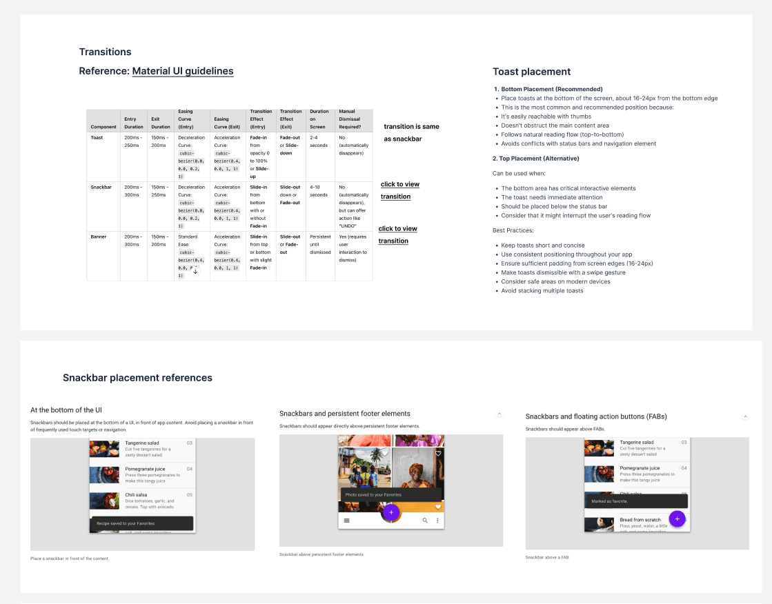
Toasts, Snackbars and Tool tips
Toasts, Snackbars and Tool tips
I incorporated system wide feedback mechanisms, including snackbars, toasts, and contextual tooltips, to guide users effectively and provide timely communication.
I incorporated system wide feedback mechanisms, including snackbars, toasts, and contextual tooltips, to guide users effectively and provide timely communication.
To ensure the platform feels responsive and helpful, I designed notification components that handle everything from system alerts to feature education.
To ensure the platform feels responsive and helpful, I designed notification components that handle everything from system alerts to feature education.
Standardized Feedback: I created a semantic color system for toasts and snackbars (Success, Warning, Information, and Danger) to provide immediate, color-coded confirmation of user actions.
Standardized Feedback: I created a semantic color system for toasts and snackbars (Success, Warning, Information, and Danger) to provide immediate, color-coded confirmation of user actions.
Contextual Assistance: I implemented tooltips and action banners to guide users through new or complex features without interrupting their primary workflow.
Dismissible Communication: By establishing clear rules for persistent vs. auto-dismissing notifications, I ensured that critical alerts (like error messages) receive the necessary attention while secondary feedback remains non-intrusive.
Dismissible Communication: By establishing clear rules for persistent vs. auto-dismissing notifications, I ensured that critical alerts (like error messages) receive the necessary attention while secondary feedback remains non-intrusive.


Feature-Specific Components
Feature-Specific Components
I grouped unique UI elements like Explore cards, Menu cards, and QR interactions, into dedicated library sections to ensure clarity and rapid feature development.
I grouped unique UI elements like Explore cards, Menu cards, and QR interactions, into dedicated library sections to ensure clarity and rapid feature development.


Unifying the Experience: The Adaptive Post Card
Unifying the Experience: The Adaptive Post Card
I engineered a single, intelligent component that dynamically reconfigures its layout based on user role, visibility permissions, and engagement data.
I engineered a single, intelligent component that dynamically reconfigures its layout based on user role, visibility permissions, and engagement data.
To bridge the gap between our dual-sided marketplace users, I utilized Figma Variants to create a 'Post Card' that adapts to the context of the viewer. This logic-first approach ensures 100% platform parity while providing unique utility for both business owners and community members.
To bridge the gap between our dual-sided marketplace users, I utilized Figma Variants to create a 'Post Card' that adapts to the context of the viewer. This logic-first approach ensures 100% platform parity while providing unique utility for both business owners and community members.
Public Business View: Optimized for brand-first identity with dynamic location-based metadata.
Public Business View: Optimized for brand-first identity with dynamic location-based metadata.
Merchant Management View: Utilizes Boolean logic to display private performance metrics (view counts) exclusively for business owners.
Privacy-First Logic: An auto-layout system that seamlessly hides location tags when data is omitted, ensuring a balanced UI in all scenarios
Privacy-First Logic: An auto-layout system that seamlessly hides location tags when data is omitted, ensuring a balanced UI in all scenarios

Engineering handoff
Engineering handoff
Each component in the design system was supported by clear documentation outlining design specifications, usage rules, and implementation guidance, ensuring smooth collaboration between designers, developers, and future contributors.
Each component in the design system was supported by clear documentation outlining design specifications, usage rules, and implementation guidance, ensuring smooth collaboration between designers, developers, and future contributors.
Standardized Specs: Provided clear documentation on tokens, spacing, and interaction logic.
Behavioral Rules: Defined focus states and error handling to ensure platform-wide consistency.
Dev-Ready Assets: Delivered organized Figma libraries to reduce implementation friction.
Dev-Ready Assets: Delivered organized Figma libraries to reduce implementation friction.

The Impact: Scale & Efficiency
The Impact: Scale & Efficiency
By building the system in parallel with active features, I established a scalable foundation without slowing down production.
By building the system in parallel with active features, I established a scalable foundation without slowing down production.
Operational Efficiency: Established a shared language between design and engineering, reducing layout time for new features by an estimated 40%.
Unified Identity: Established a single source of truth, eliminating design debt across the ecosystem.
Future-Proof Foundation: Delivered a robust, documented library that allows the team to scale and ship high-quality features with speed and consistency.
Future-Proof Foundation: Delivered a robust, documented library that allows the team to scale and ship high-quality features with speed and consistency.