A redesign and rebrand that gave a girls' education nonprofit a presence worth its mission
E-commerce
Redesign
Rebranding
Non profit
E-commerce
Nonprofit
Go Daddy
Redesign
Rebranding
A redesign and rebrand that gave a girls' education nonprofit a presence worth its mission
E-commerce
Redesign
Rebranding
Non profit
E-commerce
Nonprofit
Go Daddy
Redesign
Rebranding

Role
UX Designer
UX Designer/ Web Designer
GoDaddy Front-end
UX Designer/ Web Designer
Year
2021
2021
Team
CEO
CEO
My Impact
Complete redesign
Complete redesign
Re Branding
Re Branding
Overview
Overview
Mission-Driven E-commerce Platform Needed Better Online Presence To Fund Girls' Education
Mission-Driven E-commerce Platform Needed Better Online Presence To Fund Girls' Education
Bandar aur Bhaaloo is a nonprofit social enterprise with a unique mission: funding high school education for girls in India through the sale of handcrafted stuffed animals. Their business model relies on volunteers sewing one-of-a-kind animals from donated Indian fabrics, keeping costs minimal so maximum funds reach their NGO partners supporting girls who would otherwise stop their education after eighth grade.
Bandar aur Bhaaloo is a nonprofit social enterprise with a unique mission: funding high school education for girls in India through the sale of handcrafted stuffed animals. Their business model relies on volunteers sewing one-of-a-kind animals from donated Indian fabrics, keeping costs minimal so maximum funds reach their NGO partners supporting girls who would otherwise stop their education after eighth grade.
The challenge
The challenge
Existing website wasn't effectively supporting their business model.
Existing website wasn't effectively supporting their business model.
The founder recognized that their online presence was critical to success. The website needed to both educate visitors about the mission and facilitate product sales to generate more funding for education programs.
The founder recognized that their online presence was critical to success. The website needed to both educate visitors about the mission and facilitate product sales to generate more funding for education programs.
My Role
My Role
I was engaged through Taproot Foundation to redesign the website, working directly with the founder to improve layout, content, and navigation. The goal was to create a website that clearly communicated the mission, made products easy to discover and purchase, and ultimately increased traffic and impact for girls' education in India.
I was engaged through Taproot Foundation to redesign the website, working directly with the founder to improve layout, content, and navigation. The goal was to create a website that clearly communicated the mission, made products easy to discover and purchase, and ultimately increased traffic and impact for girls' education in India.

Problem
Problem
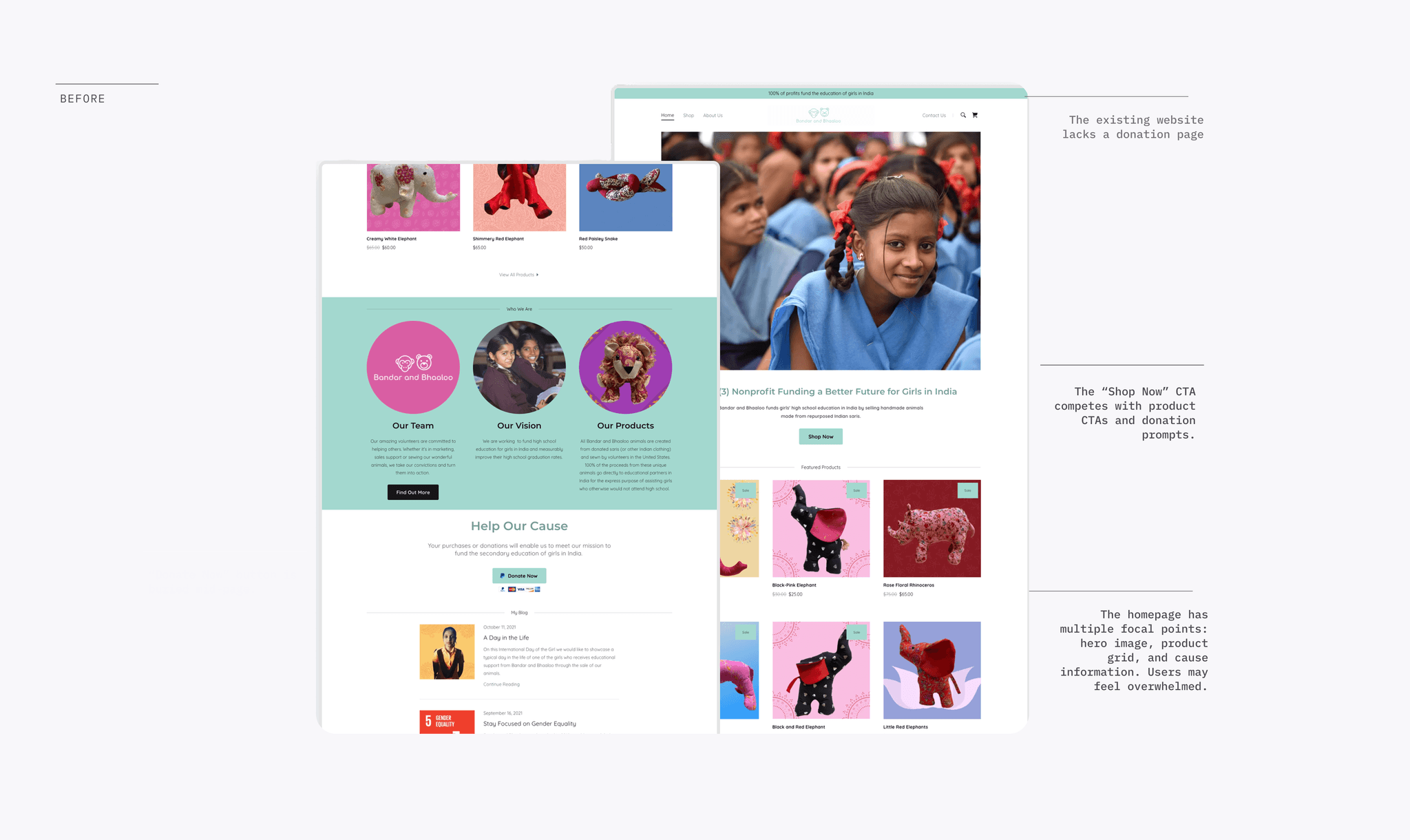
The Website Wasn't Converting Visitors Into Supporters Or Driving Product Sale Overwhelming Homepage With Competing Focus Areas
The Website Wasn't Converting Visitors Into Supporters Or Driving Product Sale Overwhelming Homepage With Competing Focus Areas
Information overload
No Dedicated Donation Page
Products Buried In Homepage Clutter
Fragmented Identity
The existing website crammed everything onto a single long scrolling homepage Visitors faced too many focal points with unclear priority, creating decision paralysis.
The existing website crammed everything onto a single long scrolling homepage Visitors faced too many focal points with unclear priority, creating decision paralysis.
Because it is a 501(c)(3) organization, donations are vital, and the existing website lacks a donation page.
Because it is a 501(c)(3) organization, donations are vital, and the existing website lacks a donation page.
All featured products appeared in a grid on the homepage causing clutter and cognitive load
All featured products appeared in a grid on the homepage causing clutter and cognitive load
Broken Core Flows
Missing Critical Data
Competing CTAs Without Hierarchy
Fragmented Identity
"Shop Now," "Find Out More," "Donate Now," product buttons, and blog links all competed without clear priority, leaving visitors uncertain which action to take.
"Shop Now," "Find Out More," "Donate Now," product buttons, and blog links all competed without clear priority, leaving visitors uncertain which action to take.
Broken Core Flows
Missing Critical Data
Competitive Audit
Competitive Audit
Analyzing the Non-Profit Landscape
Analyzing the Non-Profit Landscape
I benchmarked AshaNet and GiveIndia to understand how established players communicate impact. While both organizations have high institutional trust, their digital experiences revealed significant usability gaps.
Competitor
Key Strengths
Accessibility & UX Gaps
AshaNet
Strong use of on-site photography to build emotional connection.
High cognitive load due to excessive text, poor visual hierarchy, and poor color contrast makes text difficult for low-vision users.
GiveIndia
Excellent use of data visualization and clear navigation for transparency.
Cluttered layouts and a lack of modern white space lead to an "outdated" feel. Small touch targets hinder mobile and motor-impaired users.
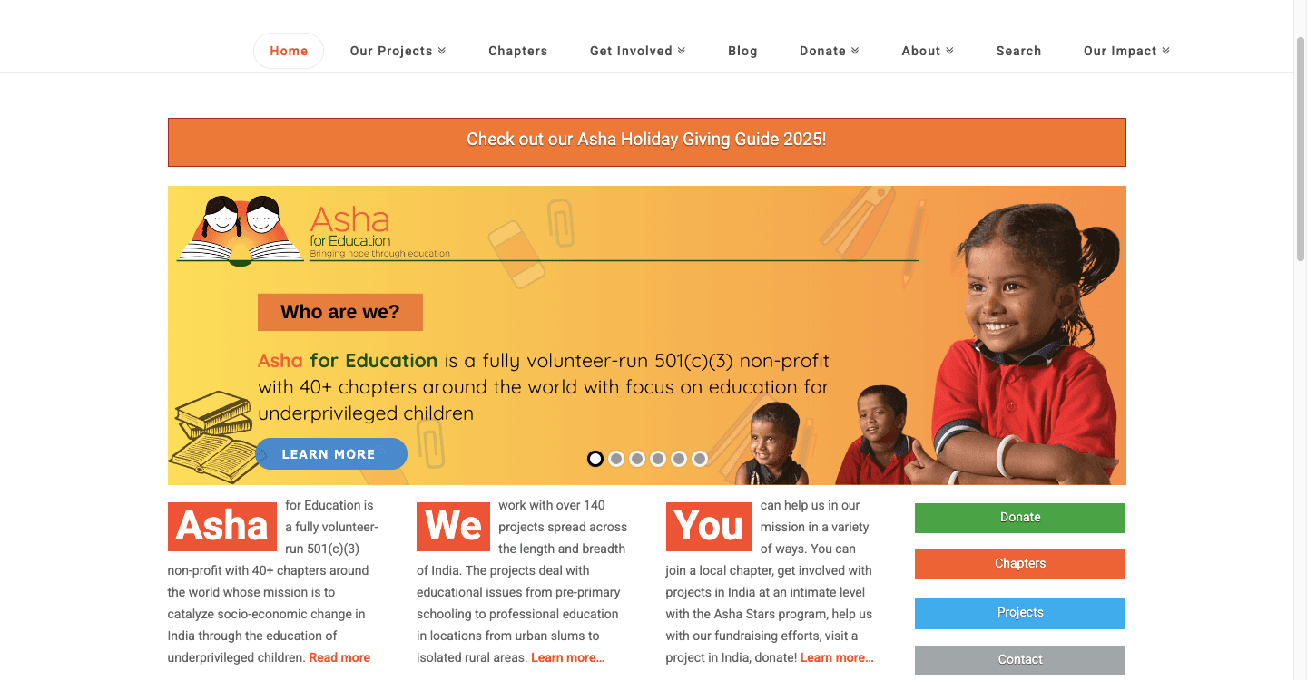
Website images of ASHANET and GIVEINDIA.

Website images of ASHANET and GIVEINDIA.
The Strategic Pivot
The Strategic Pivot
This analysis directly informed my design strategy for Bandar aur Bhaaloo. I aimed to bridge the gap between these two extremes by
This analysis directly informed my design strategy for Bandar aur Bhaaloo. I aimed to bridge the gap between these two extremes by
Simplifying the Narrative: Avoiding the "text-heavy" trap of AshaNet by using scannable, curated content.
Simplifying the Narrative: Avoiding the "text-heavy" trap of AshaNet by using scannable, curated content.
Modernizing the UI: Using generous white space and a clean layout to avoid the "cluttered" feel identified in GiveIndia.
Modernizing the UI: Using generous white space and a clean layout to avoid the "cluttered" feel identified in GiveIndia.
Businesses learn one reward configuration model
Businesses learn one reward configuration model
Customers experience seamless reward redemption
Customers experience seamless reward redemption
Outcome
A complete rebranding of the website to raise the organization's profile, mission, impact on the community, attract volunteers, and donations.
Homepage
The Problem
The original homepage tried to accomplish everything simultaneously, mission explanation, product catalog, blog posts, donation appeals, and team information, all stacked on a single long scrolling page. This created information overload, with competing focal points leaving visitors uncertain what action to take or where to focus attention first.
The Solution
Redesigned Homepage With Clear Narrative Structure To Guide Visitors Through Mission Story
Redesigned the homepage with a clear narrative structure addressing key visitor questions in priority order: Who we are (mission), What we do (business model), Student stories (impact), and Donation options (conversion). Each section maintains visual distinctiveness while contributing to a cohesive whole, creating a coherent layout that guides visitors through the organization's story and purpose.


THE SOLUTION
A complete rebranding of the website to raise the organization's profile, mission, impact on the community, attract volunteers, and donations.
About us
The Problem
The original website had minimal about information
Just a brief statement that "Bandar and Bhaaloo is a nonprofit" is all it has. Visitors had no way to understand who was behind the organization, how the business model worked, or why they should trust this nonprofit with their support.
The Solution
Designed a comprehensive About Us page that tells the complete story through organized sections
I redesigned the "About" experience to transition the site from a single sentence to a transparent, mission-driven brand. By restructuring the information architecture, I focused on building "Trust Pillars" that answer the user’s most critical questions: Who are you? Where does my money go? And why does it matter?

Blog page
The Problem
Blog posts were scattered on the homepage, difficult to browse, and lacked organization.
All blogs appeared in a grid on the homepage, competing with mission content. Since blogs are great at telling everyday stories of what the organization is doing and its thoughts, it is important to have a clear view of it.
The Solution
Dedicated page for blog to make it a storytelling tool for ongoing engagement
Created a dedicated blog page with everyday stories. This makes it easier for visitors to discover stories about the organization's impact and stay engaged with ongoing work. Added an option to signup for the blogs to keep a ling term relation with the visitors.

STORE PAGE
The Problem
All featured products appeared in a grid on the homepage, competing with mission content, team information, and blog posts. This meant visitors had no way to browse the full product catalog, filter or search for specific animals, or understand product organization. Each product card showed only image, name, and price missing the critical connection between "purchasing this elephant" and "funding education for this specific girl."
The Solution
Designed a dedicated shop page that transforms product browsing from an afterthought into a purposeful shopping experience.
This give the ability to browse and visually scan all available products in one place. Dedicated page means no competition from blog posts, mission content, or donation appeals and focus solely on product discovery and purchase decision. Also added a featured product category to add the products the CEO wanted to show.

Mission-Connected Shopping Experience
Explanation that every animal is handmade by volunteers from donated Indian saris
Clear statement of how proceeds fund girls' education
Connection between purchase price and educational funding.

Mission-Connected Shopping Experience
Explanation that every animal is handmade by volunteers from donated Indian saris
Clear statement of how proceeds fund girls' education
Connection between purchase price and educational funding.
DONATE PAGE
The Problem
The original website completely lacked a dedicated donation page, a critical missing piece for a nonprofit organization. The only donation option was a small "Donate Now" button buried mid homepage within the "Help Our Cause" section, which didn't lead to a purpose built donation experience. Visitors wanting to contribute directly to the mission, rather than purchase products had no clear pathway to do so.
The Solution
Created Dedicated Donation Pathway To Enable Direct Support From Mission Aligned Visitors
Created a page accessible from the main navigation, "Donate" in ensuring visitors can easily find the donation option from anywhere on the site rather than searching for a buried button on the homepage.

Why this matters
Many mission-aligned supporters prefer to donate directly rather than purchase products. Without a dedicated donation page, Bandar aur Bhaaloo was losing these potential contributions entirely. A buried button on the homepage doesn't serve supporters wanting to give—it creates friction and missed opportunities. The dedicated donation page respects these supporters by providing a purposeful giving experience equal to the shopping experience.
Not all visitors want to shop for stuffed animals, but they may still want to support girls' education in India. The donation page enables this support pathway, expanding the ways people can contribute to the mission beyond product purchases alone.
Contact PAGE
The Problem
Originally, the "Contact Us" page was limited to a simple digital form. This created a barrier for local supporters who wanted to save on shipping costs by picking up orders in person or those who felt more comfortable donating physical materials (like saris) at a brick-and-mortar location. The lack of a physical address and operating hours made the organization feel purely virtual and less accessible.
The Solution
Facilitating In-Person Connection
I redesigned the Contact Page to bridge the gap between digital interaction and physical logistics. The new layout balances an intuitive lead-capture form with the essential details required for a local community hub.


The Outcome
Measuring Success (Post-Launch)
To validate the redesign, I tracked key performance indicators (KPIs) over the first few months. The transition from a single-sentence landing page to a trust-focused, accessible experience led to a measurable increase in community engagement and financial support.

Challenges & Key Learnings
Navigating Platform Constraints
While the initial designs were created in Figma, the final build was executed on the GoDaddy platform. This transition presented a significant challenge: the platform’s rigid customization restricted certain visual variations, button states, and advanced interactive elements.
The UX Pivot: I learned to prioritize functional design over aesthetic flair, ensuring that despite platform limitations, the core user journey, from mission awareness to donation, remained seamless and accessible.
Ramya led the complete revamp and relaunch of the Bandar & Bhaaloo website. We needed a stronger brand focus, and she brought excellent ideas on messaging, layout, and visual impact. Her technical knowledge was impressive, she patiently resolved platform issues and reworked the site to be simpler, clearer, and more engaging end to end.
Ramya led the complete revamp and relaunch of the Bandar & Bhaaloo website. We needed a stronger brand focus, and she brought excellent ideas on messaging, layout, and visual impact. Her technical knowledge was impressive, she patiently resolved platform issues and reworked the site to be simpler, clearer, and more engaging end to end.
Deborah Hecker
Deborah Hecker
Founder & CEO
Founder & CEO
Ramya led the complete revamp and relaunch of the Bandar & Bhaaloo website. We needed a stronger brand focus, and she brought excellent ideas on messaging, layout, and visual impact. Her technical knowledge was impressive, she patiently resolved platform issues and reworked the site to be simpler, clearer, and more engaging end to end.
Deborah Hecker
Founder & CEO

Bandar and Bhaaloo Website Redesign
How rebranding and redesigning a nonprofit website made it easier for supporters to engage, contribute, and connect.
E-commerce
Redesign
Rebranding
Non profit
Non profit
Role
UX /UI Designer
Year
2021
Team
CEO and me!